Web, iOS, Android, and Windows
Modus: Sales Enablement App
Redesigning and rebuilding the ‘Modus: Sales Enablement’ app so sales reps have the tools they need to consume, share, and measure content and its effectiveness with prospects in order to advance and close deals.
Sales Enablement, Simplified.
Platform Background
The Modus platform has two main components:
• The Modus: Sales Enablement app (for sales reps) (this project).
• Media Manager (the admin tool that manages the app).
Company admins use Media Manager to fill in the Modus app for their sales reps with their branding, content, courses, and more so the sales reps can present and share content with prospects. Think of the Modus app like a prebuilt, but blank template. Companies just need to fill in the blanks with their branding (logos, colors, etc.) and add the content they want to show in the app in order to make it look like their own.
My Responsibilities
For this project, my job was to completely redesign, revamp, add new functionality, and relaunch a new app for Modus, while following a brand refresh supplied by the marketing team.
My main contributions to this work included problem-solving, research, wireframes, designing interactive prototypes, presenting to leadership, creating stories in the backlog, testing the released product, conducting functionality and wording audits, and following up with feedback given to continuously improve the user experience.
Why redesign + improve the current app?
As Modus grew and shifted, so did the mission and goals of the company. In order to bring a simplified experience with meaningful conversations in mind for the users, things had to change.
Things to know before continuing…
For privacy reasons, I cannot show real Modus client instances. So for this project, I created a brand called ‘Grumble’ to show off the Modus interface and what is possible. Grumble is a healthy meal delivery service for personal, event, and business use.
Design Needs
Complete app redesign, new functionality, app restructure, and relaunch
My Role
Project Lead / User Experience Designer / Head of User Experience and Creative Services
Teams Involved
Leadership, Development, Customer Success, and Sales
Date of Project
2022 - 2023
Operating Systems
Web, iOS, Android, and Windows
Design Tools
Adobe XD, Zeplin, and Monday.com

My Design Process
This is the process I used during this project to ensure the end product was user-centered, intuitive, and easy to use. This process involves understanding the needs and behaviors of the users, identifying their pain points, and designing a solution that meets their needs, while also achieving the determined business goals.
It’s important to note that this design process is not always linear and may involve going back and forth between the steps to refine the design.
Define > Design > Develop > Repeat
Phase 1: Define + Research
1. Defined the Objectives and the Goals of the Platform
First, we defined objectives and goals for the new app, what success looks like, and defined starting points to work off of. This information was based off of our own understanding of the current app, what it looked like from a development standpoint, and from previous client feedback / experiences.
Known Admin + Sales Reps Goals (End-users)
Distribute: As an admin, I want to effectively distribute content to my sales reps.
Consume: As a sales rep, I want to efficiently consume and find new and existing content.
Share: As a sales rep, I want to quickly share content and customize sharing experiences for my prospects.
Measure: As an admin, I want to measure app activity, sales rep activity, and content effectiveness.
As a developer, I want to clean up old code and start fresh on new functionality.
Business Goals (Modus)
As a developer, I want to focus on innovation.
As a marketer and sales rep, I want a clearer way to talk about the Modus platform. More use cases!
As a support representative, I want solutions for our clients from support tickets on the same issues.
2. Reviewed Existing Platform and Interviewed Current Users
Audited and analyzed the current platform, asked what was working and what was not, and determined areas that could be focused on for improvement.
How is Modus different from other sales enablement platforms?
The main difference between Modus and other platforms in the space, is Modus has a ‘Sales Enablement, Simplified’ approach.
With simplicity in mind, Modus is on a mission to create meaningful interactions between sellers and buyers without all of the advanced tools and features other sales enablement software programs bring that may require intensive training and funds in order to use effectively.
What does the legacy (previous) app have, that current sales reps want to keep in the next generation?
Content structure (admins and users like how the content is organized)
Downloadable + offline content
List of recently shared content
Creating user-curated groups of content
What areas from the legacy (previous) app can be improved for the sales reps?
Smoother + more intuitive share flow
Cleaner + easier search experience (filtering, sorting, and more metadata)
Consistent app experience across different devices (Web, tablet, and mobile)
Centralized areas to work with assets and Digital Sales Rooms (before sharing)
How is this causing pain for the users?
The sharing experience is difficult + non-intuitive which is leading to user task abandonment.
Search is becoming an unutilized feature because the layout is cluttered, which makes it hard to find assets.
Conversations are becoming bland + less meaningful since there isn’t much room for personalization.
Inconsistency in the app experience and features leads to users thinking there’s something broken.
After reviewing previous and current feedback, and reflecting on business and user goals, these items became the focus points for innovation.
Content Discovery
Sharing Content
Personalized Experience
Search Experience
3. Reviewed User Feedback and Data Analytics
Collected and analyzed user feedback about the future vision, the focus points in mind (listed above), and any other functionality enhancements that could be made in the process. Looked for reoccurring ideas, issues, pain points, and improvement opportunities that could help during the redesign.
Findings:
“A way to favorite or save content.”
“Digital Sales Room customization and additional privacy options when sharing content.”
“More actions to take on assets.”
4. Competitive Analysis (Done by another team)
Reviewed the competitive analysis and how we differ in the space in the focus points (listed above). This analysis included a feature comparison, an overview of where we are in the software space, and rating differentiation on the platform to really understand their strengths and weaknesses.
5. Reviewed and Updated Existing User Personas and Target Users
We identified and created new user personas to represent the different types of users who will interact with the Modus platform based off of the existing personas. The main personas for the Modus Sales Enablement App are the sales representatives who will be using the app, the admins / content creators who will be in charge of the administration of the app, and the prospects who will be receiving and interacting with the content shared by the sales representatives.
6. Created User Journey Maps
Created user journey maps for each persona to understand the process each would go through while using or interacting with this sales enablement app or child functionality. Then added where the new proposed functionality could play a part during each step of their experiences.
(* = Modus Feature or Functionality)
Sales Representatives
Sales Managers
Marketing Managers
Potential Prospects
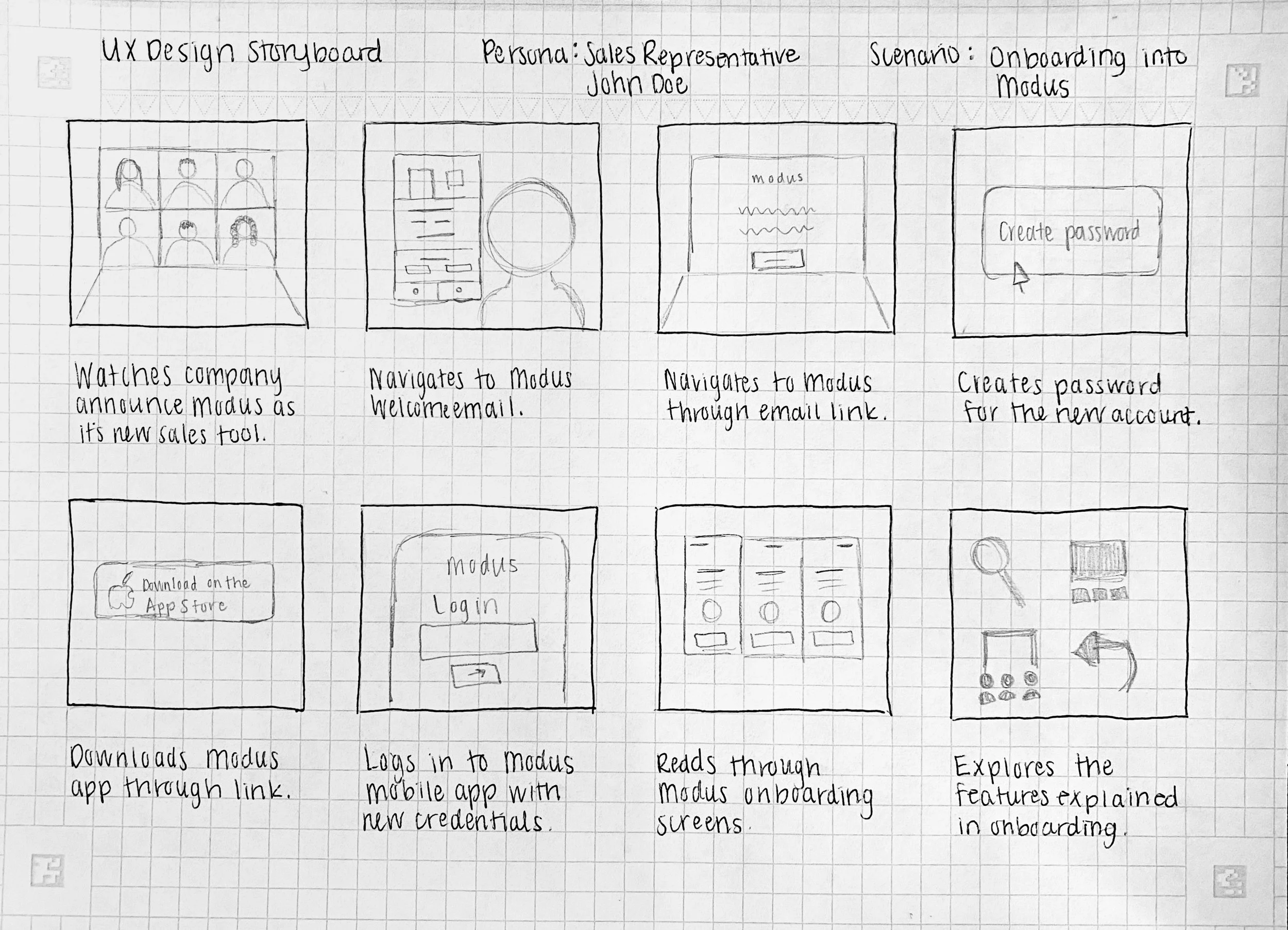
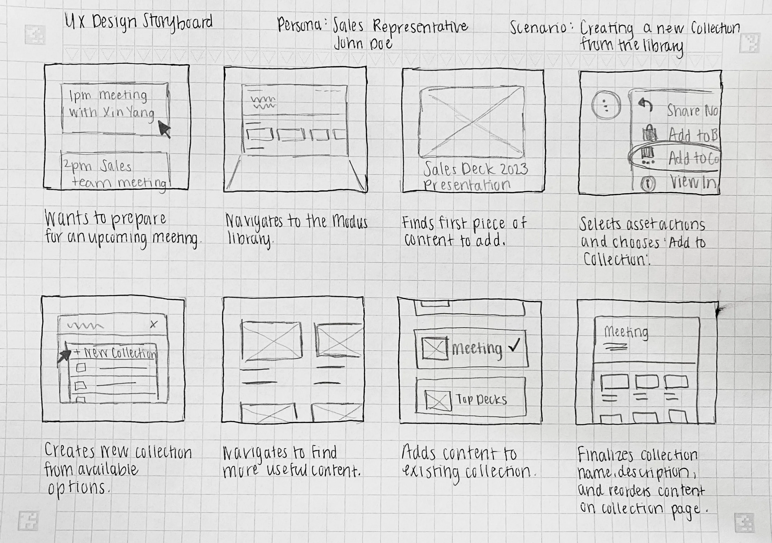
7. Created Storyboards
Once the user journey maps were in place, I focused on specific interactions, scenarios, and tasks within their journeys. The goal here was to visualize the actions and interactions between the platform and the user interacting with it.
8. Information Architecture / Sitemaps
Created sitemaps and worked on the information structure to get a good understanding of the available capabilities and how they would all fit together.
Phase 2: Design + Prototype
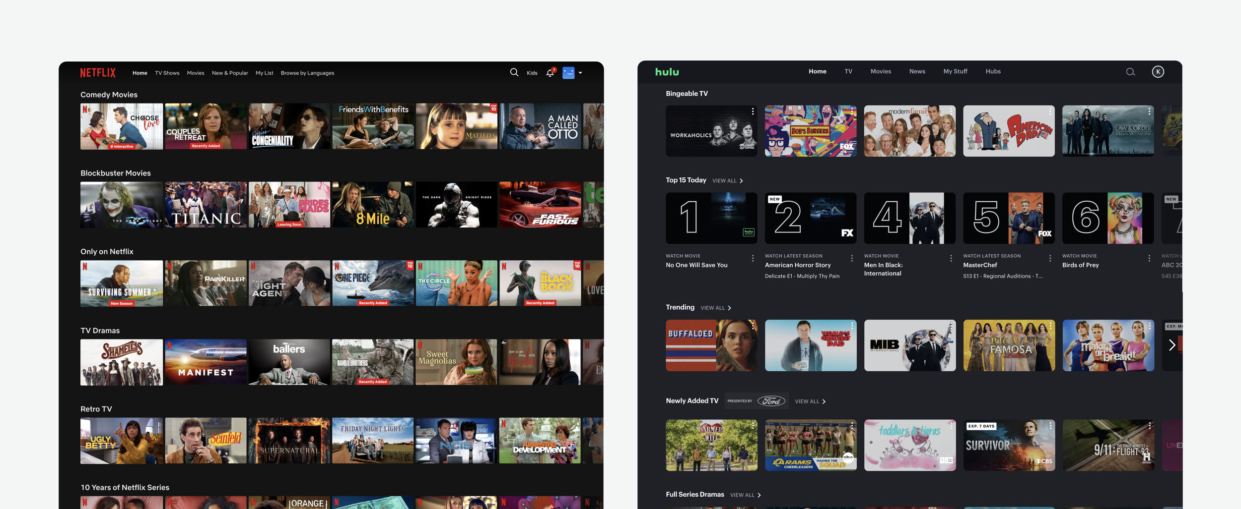
1. Brainstormed, Collected Inspiration, and Created Mood Boards
Creating a mood board helps me shape future visions and helps the overall desired aesthetic come to life. I used Hulu, Netflix, and more as an inspiration when it came to the smart ribbons, asset viewing (dark mode focus), and content discoverability approach.
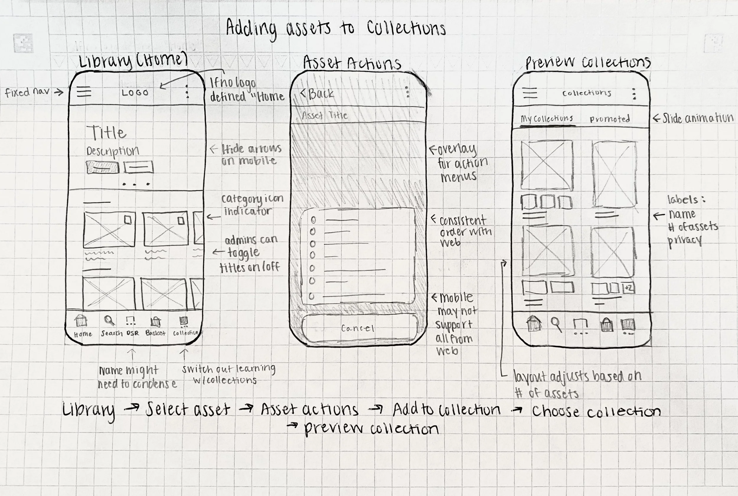
2. Sketched it Out and Created Low-Fidelity Wireframes
After gathering design inspirations and reviewing research findings, I started to sketch out possibilities for the main structural pages of the software (Library, Subcategory, Asset View, Search, Basket, and more) until I had a good foundation to build on.
3. Created High-Fidelity Wireframes and Shared in Review Meetings
Utilizing the sketches that were created, I started to make high-fidelity wireframes to get a grid system and solid base in place. Next, there was a meeting with company leadership, a development leader, and a marketing leader to get feedback on the direction it was going.
Reviewed Testing Findings: (7 Tested Users)
• 71% of tested users preferred to have the option to have asset titles on top of categories or disabled.
• 100% of tested users wanted the option to put the asset titles and asset types beneath the ribbon images.
• 71% of tested users preferred to have smaller asset sizes on ribbons so you could see a bit more on the home screen at first glance.
• Tested users were having trouble with the asset action on hover so we moved them to sit under the asset’s description.
• Tested users suggested Favorites, Collections, and Downloads to start with “My”.
• Tested users suggested similar ratios for all asset image ribbons throughout the platform.
• Tested users suggested group picker on the library and the settings page for the web app.
• Tested users were having trouble with banner size differences on web and mobile, so we made a story for a Media Manager feature to be able to add separate images.
4. Created Modus’s First Design System
Once the high-fidelity wireframes were reviewed and approved by leadership, I started to create a working document, prototype, and exportable components for myself to use during the design process. As the design process continued, I’d come back, add, or update components so that once the developers were ready to create this new app, they’d have this to work off of as well as the Zeplin files. This design system was also used for future functionality in order to ensure consistency and accessibility and provide brand guidelines.
Colors, typography, and buttons
Modals, search bars, and breadcrumbs
Icons and wording (taxonomy created by another team)
Navigation bars, menus, and many other components
5. Created Mockups, Solidified UI Design, and Created Prototypes
Once the design system and main components were approved and ready to go, I started to build out the main high-level structure prototype.
6. Presented to the Team, Collected Feedback, and Adjusted
Once the main high-level prototype was approved, I started to drill down into different sections and more specific flows within the app.
Findings:
• Additional information was requested for asset info drawer menus.
• Additional information was requested for asset info hover cards.
7. Started In-Depth User Testing
Once those prototypes were ready, they were brought into and presented in many meetings by different people to get opinions from prospects, clients, and inside the business.
Highlights:
• Tested users commented highly on the user interface and ability to customize Modus to make it their own.
• Tested users commented highly on the overall structure of the app naming it “very intuitive”.
8. Made Adjustments, Tested, and Repeated
During the testing phase, many meetings were held to make sure everything was just right. Iterations helped make the product better.
9. Once a design was finalized and approved by all sides of the business, I mapped out the desired animations, hover states, etc. for the developers.
Highlighted + fan-favorite animations:
• Page load navigation and banner options fade and fall in from the top.
• Cards appeared on asset hover and category images zoomed on hover.
• Loading skeleton on asset items.
• Hover text bubbles on all buttons throughout the platform.
• When actions were taken on assets, confirmation indicators showed up on the middle and top of the screen with a countdown bar and undo button (only on undoable actions).
Phase 3: Development + Refine
1. Listed Priorities and Wrote Stories
The project team and I wrote and kept track of the stories before they were implemented on each device project board.
2. Conducted Final Audit of All Devices
I created multiple audit sheets to check for consistency across platforms since this was a problem stated by users on the legacy app. These audit sheets covered verbiage, functionality, action options, and more. By the end of the audit, all items were cohesive and consistent (excluding device-specific functionality) on every device for the platform.
3. Tested and Supplied Feedback
The project team, QA, and I tested and kept track of the stories that were written before deploying.
4. Implemented
The app was ready for showtime!
The Solutions to the Main Focus Points Listed Earlier
Improved content discoverability
• Provided sales reps with AI-powered and activity-driven asset ribbons; Most Engaged, Recently Viewed, Most Popular, Recently Added + Updated, and My Favorites.
• Enhanced the search experience. (More info on the point below and to the right).
Simplified the share flow + promoted the personalization of digital sales rooms in order to encourage meaningful conversations
• Provided new options to share content; ‘quick share’ and ‘build a digital sales room’.
• Provided new tools to customize each digital sales room; customizable header and branding.
Added more personalizable experiences for sales reps to make their experience their own
• Provided sales reps with multiple workflow areas; basket, presentation builder, personal collections, downloads, and more.
• Provided sales reps with a way to save content for quick access; personal collections and favorites.
• Provided sales reps with smart activity-driven ribbons based on their specific activity.
Enhanced the search experience, add more options for filtering, and add more metadata to assets
• Added more metadata to assets (creator, creation date, tags, tag groups, and more).
• Created filtering and sorting options. Filtering options were based on tags, asset metadata, and asset types.
• Added options to search by; keywords and tags.


Take a look at
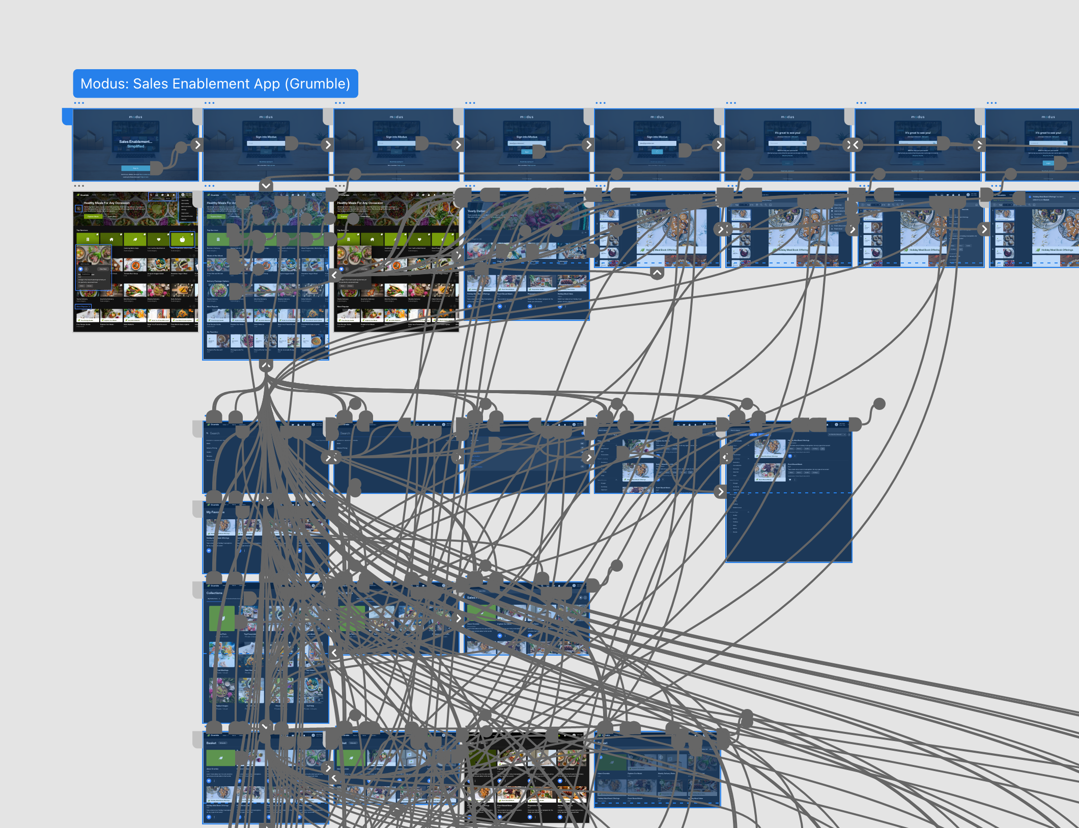
The Prototype Videos
Since these videos are based on a recorded prototype within design software, some animations and interactions are not shown.
Enter through Modus
Sign-In and Authentication
The sign-in experience offers many routes of authentication dependent on your use case. In this example, you’re previewing how a sales rep would log into the Modus platform on the Web app.
Improved content discoverability
Library, Navigation,
and Search
• Smart Ribbons: Admins can create ribbons from pre-existing templates in order to add AI + Analytic-driven content to their sales rep’s library screens. These ribbons included Recently Viewed, My Favorites, Most Popular, Recently Added, and Most Engaged.
• Updated library features (grid vs ribbon view).
• Updated search experience: More metadata, filtering, tags, and sorting. Search by keywords and tags.
• Carousels: Main banner images with CTAs that can link to any assets or outside links.
Added more personalizable experiences for sales reps to make their experience their own
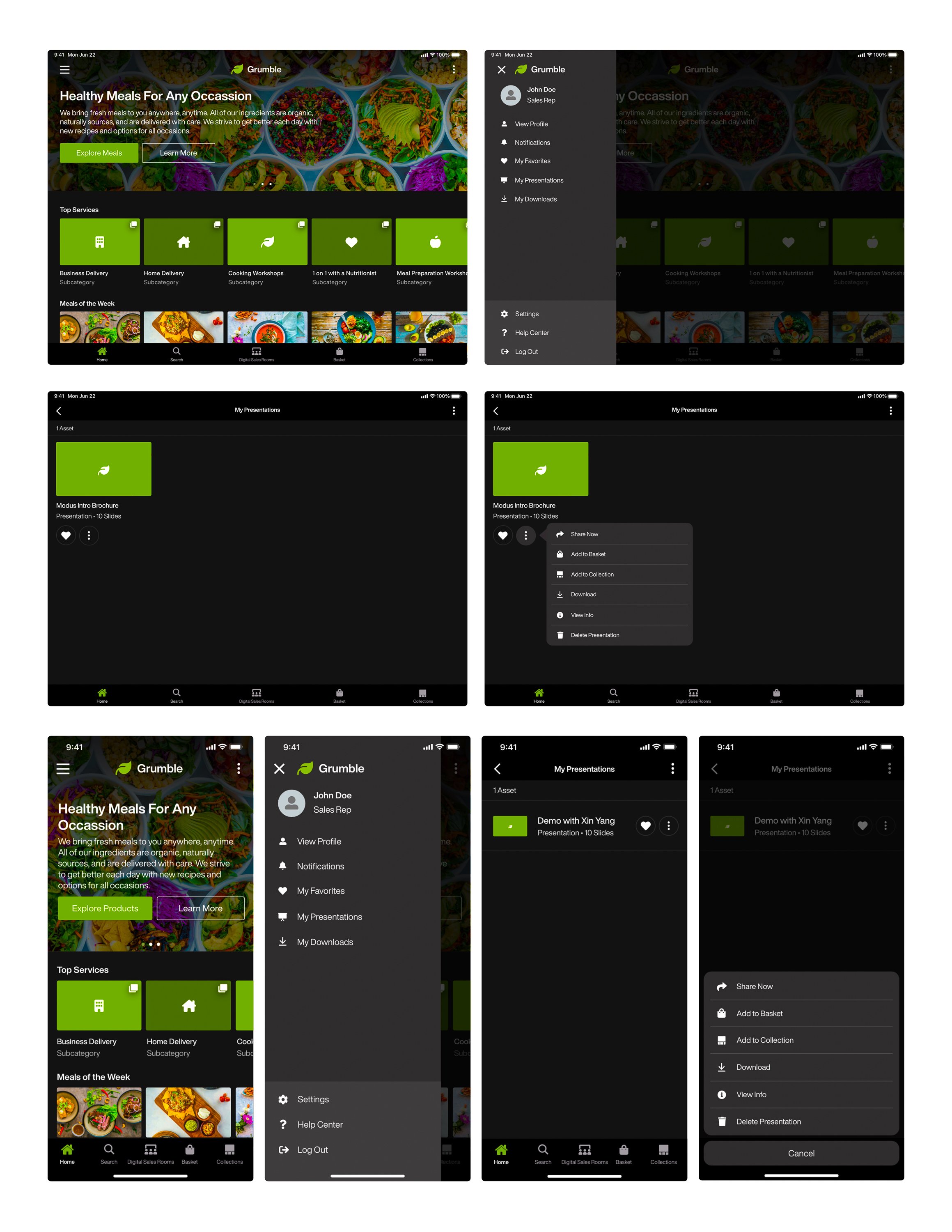
Collections, My Favorites, and My Presentations
• New workflow areas; basket, presentation builder, personal collections, downloads, and more.
• Added ways to save content for quick access; personal collections and favorites.
App Store Previews
-

Apple App Store (iOS)
This app is available for download on phone and tablet for Modus clients and their specific users.
-
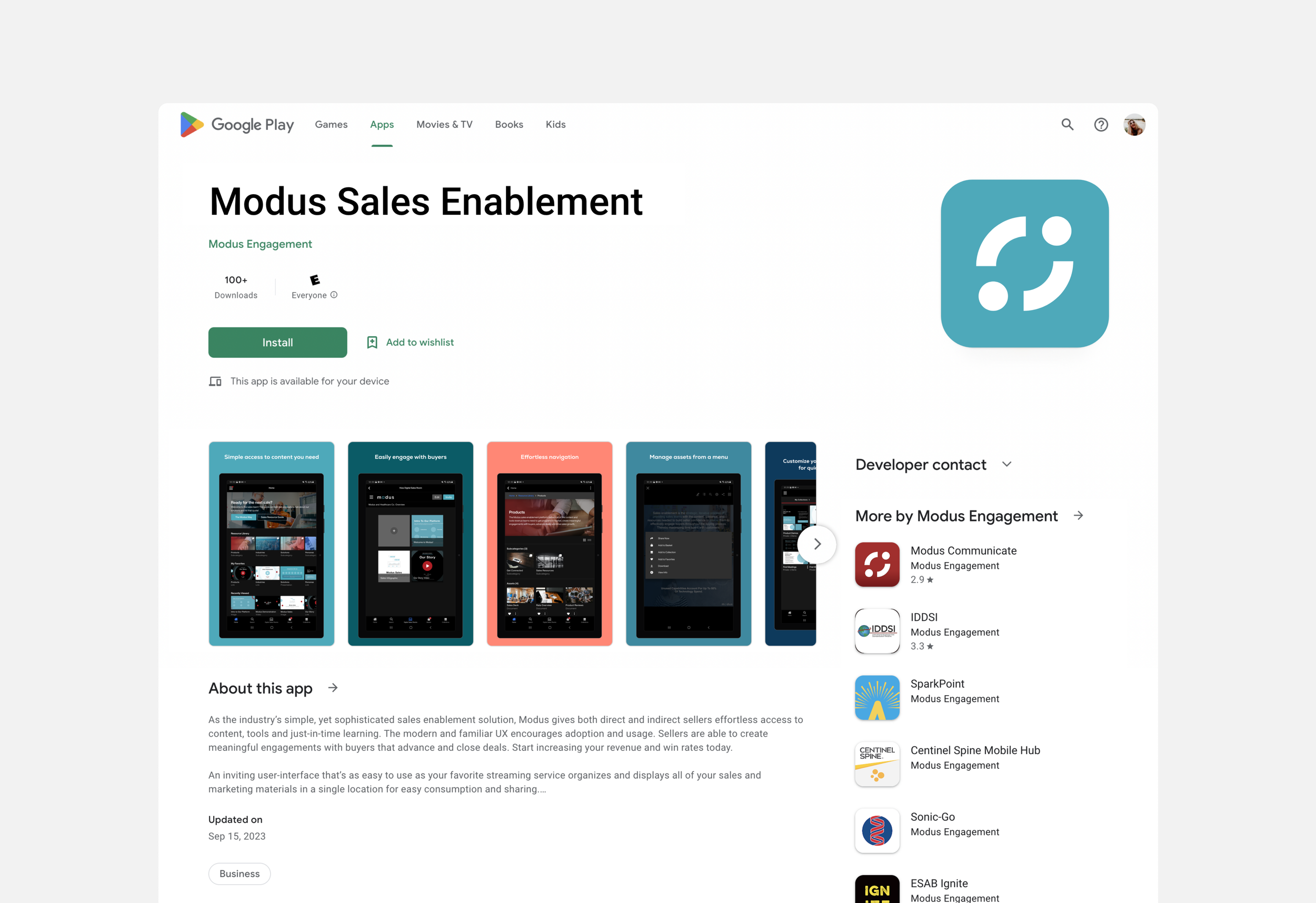
Google Play Store (Android)
This app is available for download on phone and tablet for Modus clients and their specific users.
-

Microsoft Store (Windows)
This app is available for download on tablet for Modus clients and their specific users.


