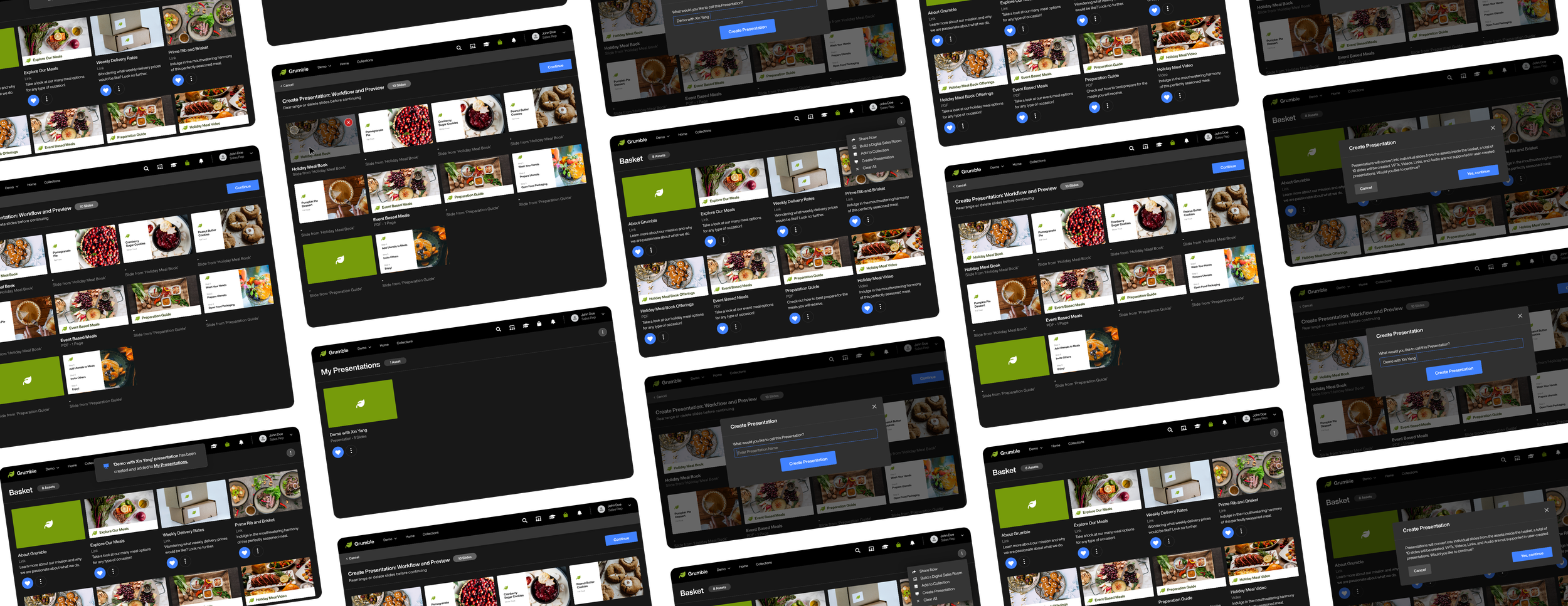
Web
Modus: Presentation Builder
Creating a simplified presentation tool that provides sales reps with the ability to build out, combine, and edit custom presentations based on prebuilt slides and presentations within their company’s instance.
Project Overview
Platform Background
The ‘Modus: Sales Enablement App’ is a sales enablement solution that provides sales reps with the tools they need to consume and share content, and measure its effectiveness with prospects in order to advance and close deals. Modus was going through a full app redesign, which meant each tool would be going through an evaluation, would be restructured, and enhanced.
My Responsibilities
For this project, my job was to completely redesign, add new functionality, and restructure the Presentation Builder for Modus.
My main contributions to this work included problem-solving, research, wireframes, designing interactive prototypes, presenting to leadership, creating stories in the backlog, testing the released product, conducting functionality audits, and following up with feedback given to continuously improve the user experience.
Why redesign + improve the current app?
As Modus grew and shifted, so did the mission and goals of the company. In order to bring a simplified experience with meaningful conversations in mind for the users, things had to change.
Things to know before continuing…
For privacy reasons, I cannot show real Modus client instances. So for this project, I created a brand called ‘Grumble’ to show off the Modus interface and what is possible. Grumble is a healthy meal delivery service for personal, event, and business use.
Design Needs
Functionality redesign, new functionality, and restructure
My Role
Head of User Experience and Creative Services
Teams Involved
Leadership, Development, Customer Success, and Sales
Date of Project
2022 - 2023
Operating Systems
Builder: Web Only
Presentation List: Web, iOS, Android, and Windows
Design Tools
Adobe XD, Zeplin, and Monday.com

My Design Process
This is the process I used during this project to ensure the end product was user-centered, intuitive, and easy to use. This process involves understanding the needs and behaviors of the users, identifying their pain points, and designing a solution that meets their needs, while also achieving the determined business goals.
It’s important to note that this design process is not always linear and may involve going back and forth between the steps to refine the design.
Define > Design > Develop > Repeat
Phase 1: Define + Research
1. Defined the Objectives and the Goals of the Presentation Builder
First, we defined objectives and goals for the presentation builder, what success looks like, and defined starting points to work off of. This information was based on our own understanding of the functionality, what it looked like from a development standpoint, and from previous client feedback / experiences.
Known Admin + Sales Reps Goals (End-users)
Distribute: As an admin, I want to make sure my sales reps are using pre-approved content during presentation creation.
Create: As a sales rep, I want to efficiently and easily create new presentations for upcoming meetings.
Share: As a sales rep, I want to easily find and quickly share presentations that I’ve created.
As a developer, I want to clean up old code and start fresh on new functionality.
Business Goals (Modus)
As a developer, I want to focus on innovation and new functionality that will benefit all clients.
2. Reviewed the Existing Platform and Interviewed Current Users
Audited and analyzed the current platform, asked what was working and what was not, and determined areas that could be focused on for improvement.
How is Modus different from other sales enablement platforms?
The main difference between Modus and other platforms in the space, is Modus has a ‘Sales Enablement, Simplified’ approach.
With simplicity in mind, Modus is on a mission to create meaningful interactions between sellers and buyers without all of the advanced tools and features other sales enablement software programs bring that may require intensive training and funds in order to use effectively.
Which features in the current presentation builder do sales reps want to keep in the updated version?
Naming and renaming of the presentation
Reordering of slides
A centralized place for user-created presentations
Which features in the current presentation builder can be improved for the sales reps or admins?
Admins need a way to keep sales reps from adding items or wording that hasn’t been pre-approved.
Cleaner, simpler, and easier preview interface
Duplication of user-created presentations
No way to edit, duplicate, or combine previously created presentations. No way to add other types of content.
How is this causing pain for the users?
Users are adding verbiage that isn’t approved by the business which can lead to false information or mistrust from prospects.
With so much currently going on in the interface, there’s a lot of room for confusion.
Conversations are becoming bland + less meaningful since some presentations only cover a certain amount of use cases.
After reviewing previous and current feedback, and reflecting on business and user goals, these items became the focus points for innovation.
Cleaner interface + flow
Simplify capabilities
Combine, edit, and reorder
Place for created assets
3. Reviewed User Feedback and Data Analytics
Collected and analyzed user feedback about the future vision, the focus points in mind (listed above), and any other functionality enhancements that could be made in the process. Looked for reoccurring ideas, issues, pain points, and improvement opportunities that could help during the redesign.
Findings:
“Presentation builder is currently only available for a few clients, would like this to be a broader feature for everyone.”
“Ability to edit and delete user-created presentations.”
4. Competitive Analysis (Done by another team)
Reviewed the competitive analysis and how we differ in the space in the focus points (listed above). This analysis included a feature comparison, an overview of where we are in the software space, and rating differentiation on the platform to really understand their strengths and weaknesses.
5. Reviewed Existing User Personas and Target Users
We identified and created new user personas to represent the different types of users who will interact with the Modus platform based off of the existing personas. The main personas for the Modus Sales Enablement App are the sales representatives who will be using the app, the admins / content creators who will be in charge of the administration of the app, and the prospects who will be receiving and interacting with the content shared by the sales representatives.
6. Reviewed User Journey Maps
Reviewed the sales representative’s user journey map to understand the process they would go through while using or interacting with this sales enablement app or child functionality. Then, I added where the new proposed functionality could play a part during each step of their experience.
(* = Modus Feature or Functionality)
Sales Representatives
7. Created Storyboards
Once the user journey maps were in place, I focused on specific interactions, scenarios, and tasks within their journeys. The goal here was to visualize the actions and interactions between the platform and the user interacting with it.
Phase 2: Design + Prototype
1. Brainstormed and Created Mood Boards from Similar Tools in the Presentation Space
I wanted to get a good idea of what the other presentation tools did when it came to a grid layout and reordering.
A few tools I checked out -
Google Slides
PowerPoint
Beautiful.ai
2. Sketched it Out and Created Low-Fidelity Wireframes
After gathering design inspirations and reviewing research findings, I started to sketch out possibilities for the main structural pages of the software (Library, Subcategory, Asset View, Search, Basket, and more) until I had a good foundation to build on.
3. Created High-Fidelity Wireframes and Shared in Review Meetings
Utilizing the sketches that were created, I started to make high-fidelity wireframes to get a grid system and solid base in place. Next, there was a meeting with company leadership, a development leader, and a marketing leader to get feedback on the direction it was going.
• 71% of tested users preferred to create the presentation name after creating the presentation vs. before.
• 100% of tested users were able to make it through multiple tasks successfully. (Reorder slides 9 and 10, then navigate to the created presentation).
• 100% of tested users preferred to have the proposed slide count in the first modal.
Testing Review Findings: (7 Tested Users)
• Tested users suggested adding language to explain which assets are unavailable to be added to a presentation (content that requires online capability ex. links and vpts).
• Tested users wanted to know the creation date of user-created presentations.
• Tested users wanted assets in the basket to stay instead of being replaced by the newly created presentation.
4. During the wireframing stage and mockup stage, I referenced the Modus Design System I created
As the design process continued, I’d come back, add, or update components so that once the developers were ready to create this new functionality, they’d have this to work off of as well as the Zeplin files. This design system was also used for future functionality in order to ensure consistency and accessibility and provide brand guidelines.
Colors, typography, and buttons
Modals, search bars, and breadcrumbs
Icons and wording (taxonomy created by another team)
Navigation bars, menus, and many other components
5. Created Mockups, Solidified UI Design, and Created Prototypes
Once the design system and main components were approved and ready to go, I started to build out the main high-level structure prototype.
6. Presented to the Team, Collected Feedback, and Adjusted
Once the main high-level prototype was approved, I started to drill down into different sections and more specific flows within the app.
Findings:
• Additional information was requested for asset info.
Highlights:
• Tested users commented highly on the initial indicator for the number of slides before the presentation was ready for editing.
• Tested users commented highly on the simplicity of the presentation creation flow.
• Tested users commented highly on the placement of ‘My Presentations’ in the navigation.
7. Started In-Depth User Testing
Once those prototypes were ready, they were brought into and presented in meetings by different people to get opinions from prospects, clients, and inside the business.
8. Made Adjustments, Tested, and Repeated
During the testing phase, many meetings were held to make sure everything was just right. Iterations helped make the product better.
9. Once a design was finalized and approved by all sides of the business, I mapped out the desired animations, hover states, etc. for the developers
Highlighted + fan-favorite animations:
• Presentations take a bit to load after being created, so we made a cover loading spinner for this.
• The new re-order drag and drop animation and UI.
Phase 3: Development + Refine
1. Listed Priorities and Wrote Stories
The project team and I wrote and kept track of the stories before they were implemented on each device project board.
2. Conducted Final Audit of All Devices
I created an audit sheet to check for consistency across platforms. This audit sheet covered verbiage, functionality, action options, and more. By the end of the audit, all items were cohesive and consistent (excluding device-specific functionality) on every device for the platform.
3. Tested and Supplied Feedback
The project team, QA, and I tested and kept track of the stories that were written before deploying.
4. Implemented
The feature was ready for showtime!
The Solutions to The Main Focus Points Listed Earlier
Cleaned up the interface and flow
• Used consistent UI and styles from the Design System that are used throughout the entire platform so it’s obvious you’re still in Modus.
• Updated verbiage to match the Modus taxonomy for consistency.
Simplified capabilities
• Minimized and hid unused features from the previous builder.
• Created new features with minimal steps and clicks.
• Only provided capabilities that passed admin approval in order to ensure appropriate verbiage and designs were used by sales reps with prospects.
Added capabilities to combine, edit, and reorder new and existing assets to create new presentations
• The previous builder did not allow adding assets other than presentations to a presentation. Now users can add images and PDFs as individual slides.
Added a centralized place for created assets, ‘My Presentations’
• This area keeps track of the creation date and the number of slides for each user-created presentation.


Take a look at
The Prototype Videos
Since these videos are based on a recorded prototype within design software, some animations and interactions are not shown.
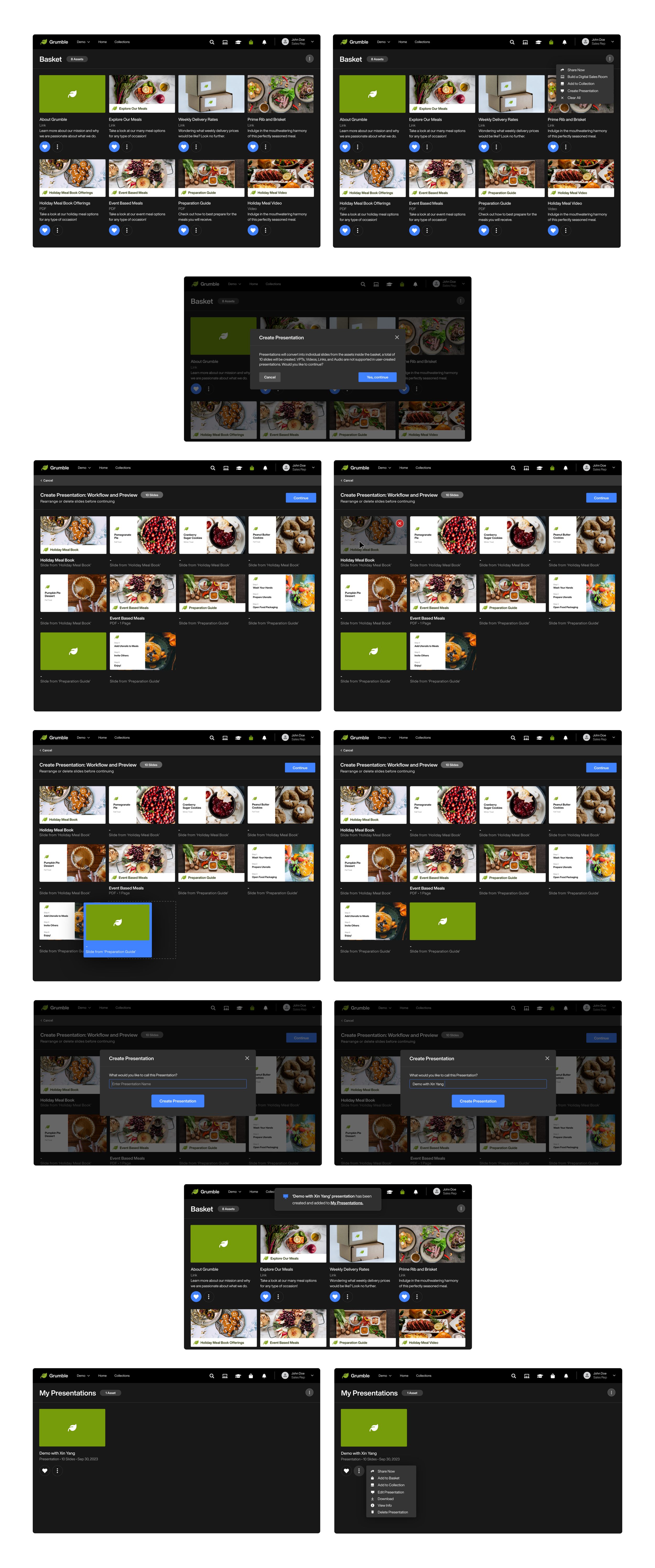
From the Basket Page
Create Presentation
In this example, you’re previewing how a sales rep would use the assets in their basket to create a presentation, reorder the slides, and name it.
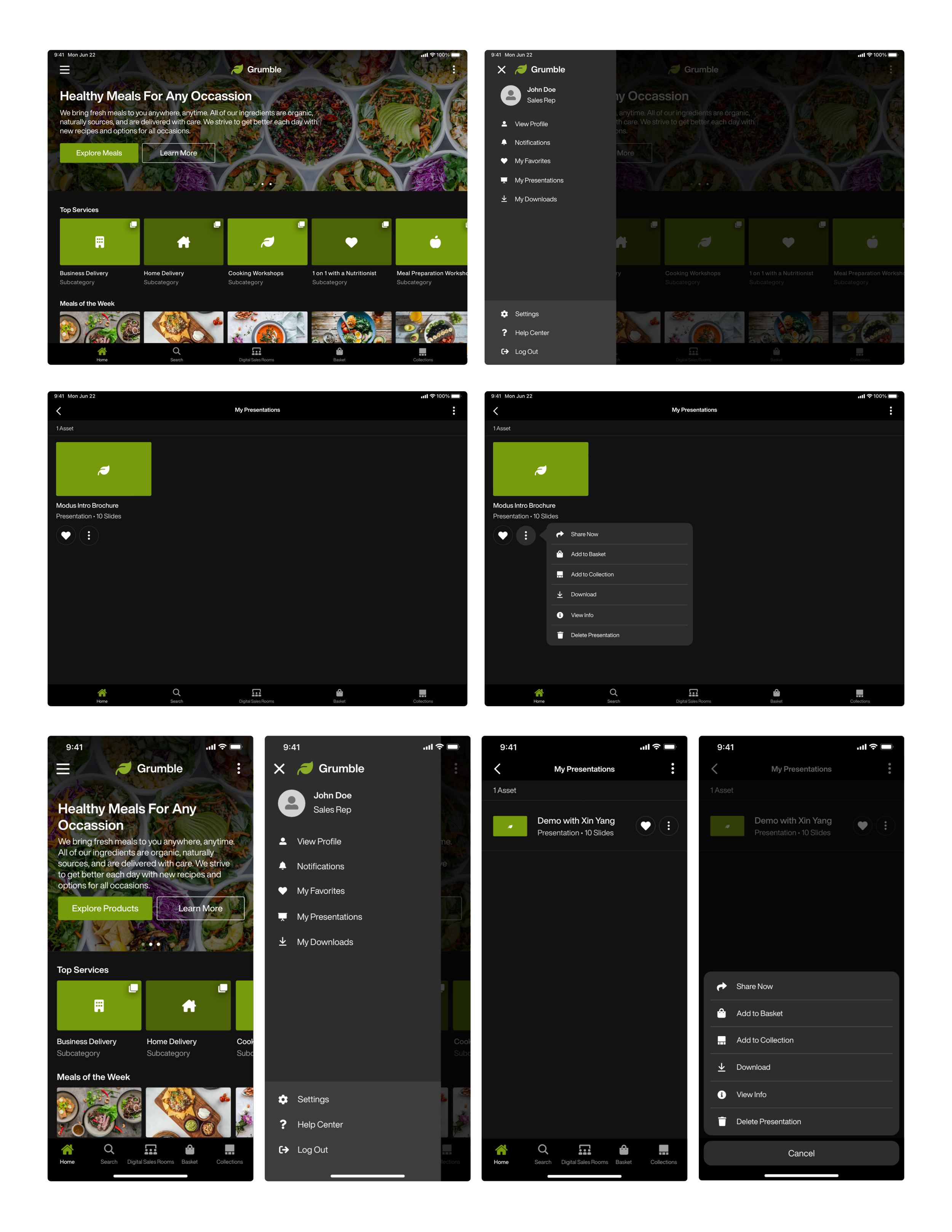
Tablet View
Navigate to My Presentations
In this example, you’re previewing how a sales rep would navigate to ‘My Presentations’ on their mobile devices. The editing capabilities are only on the Web, but we still wanted sales reps to be able to use the content they created on the fly.


